As a CPS student, I am very glad to see the debut of the brand-new student portal, namely Aspen, provided by Follett. Admittingly, the new portal provides students with a lot much information, including their schedules, calendars, and even a quick glance of their transcript, and the new parent portal enables parents to view the bill and even make payments online. However, shortly after the district officially switched to Aspen, I started to hear a lot of complaints from students. Most of the complaints mention the web interface. Many students think the new interface is less intuitive and a little bit harder to navigate compared to the previous portal which only shows you the grades. Many other complaints are about the mobile version of the portal. Even though there is a mobile view for the portal, the mobile version is apparently even harder to navigate. In terms of “mobile apps”, there is one in the App Store (developed by Follett), but that app is somehow not available for CPS students with a notification saying that the district has disabled the mobile portal. Even though students can still go to the website and check their grade, it requires extra steps and it’s just not preferable for such a simple task. The smartphone is definitely the handiest tool for students nowadays to check their grades, and I think as a new, integrated student portal, a well-functioning mobile app is indispensable.
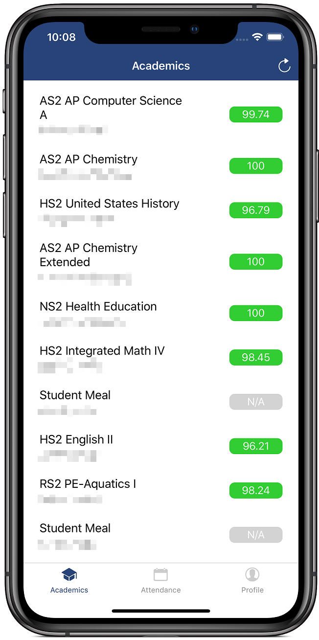
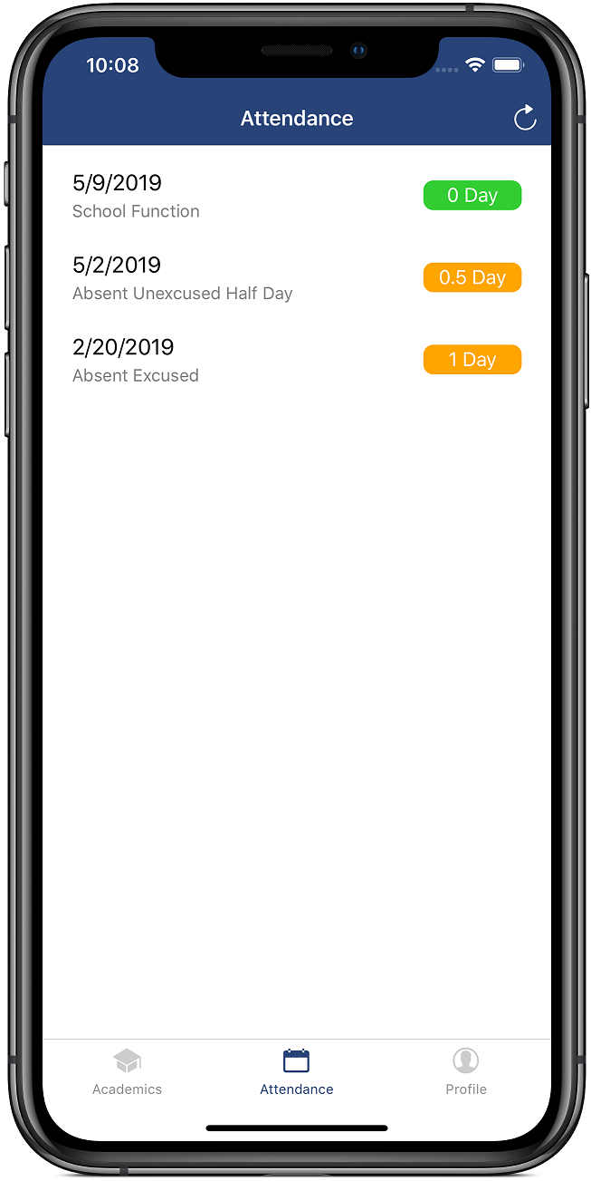
To address this problem and simply provide a more intuitive app to my friends at school, I made this app called GradeTree using React Native. It is currently available for both iOS and Android platform. I did not make this app to profit by any means, and I didn’t mean to compete with the official app. The only thing I want to achieve through making this app is to make the process of checking grades more convenient, and I am sure that’s also the goal of Aspen itself in the first place.
Fig 1 - Notification showing that the mobile app is not available.
How does the app work?
Many people have expressed their concerns over the security of this app and some doubted that I exploited some undisclosed API to make the app. The app solely relies on a simple web technology called Web Scraping. To put it in simple terms, it is like the reverse process of displaying information on a webpage. The app caches the webpage containing grade information and parses the HTML elements in the webpage. By filtering the HTML elements that meet certain criteria (for example, grade information is often enclosed in a table, so I can filter all the elements but the table with grade information), I can extract the data from the webpage and display it on the screen. During the entire process, the app never attempts to gain direct access to the database and cannot access other people’s personal information. For the authentication process, the app sends standard HTTPS requests exactly the same way as the website does. The cookie obtained during authentication is then stored securely and locally on the user’s device and is not used for any other purposes.
The app sends requests to the Aspen website and the response is an HTML page. The source code (HTML) of the page is then used to construct a DOM tree. By using certain libraries, the DOM tree is scanned with keywords. Just like most websites, the HTML elements of the Aspen website have “id”s assigned. For example, the first name field in Personal Info page is assigned with an id propertyValue(relStdPsnOid_psnNameFirst)-span. After extracting those values from the HTML page, I can then store them in variables and reformat them to show them on the user’s screen.
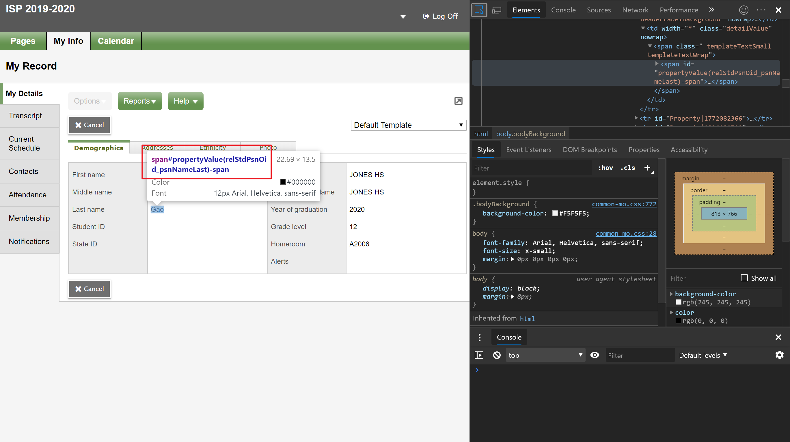
Fig 2 - Screenshot explaining Web Scraping
Is the app secure?
As I mentioned before, the credentials are sent through protected HTTPS requests, so there should not be any security issues in terms of the request. For convenience purpose, the app stores user’s login information locally. The information is stored in a local database embedded into the app. There’s no way to access the actual database even if the attacker has the access to the file system of the phone since the data is not stored in a file.
I understand the concern on storing credentials, so I am currently implementing an encryption system which encrypts the login information and stores it in the encoded form. After the encryption system and algorithm are done, there should be no longer any risks of private information leakage.
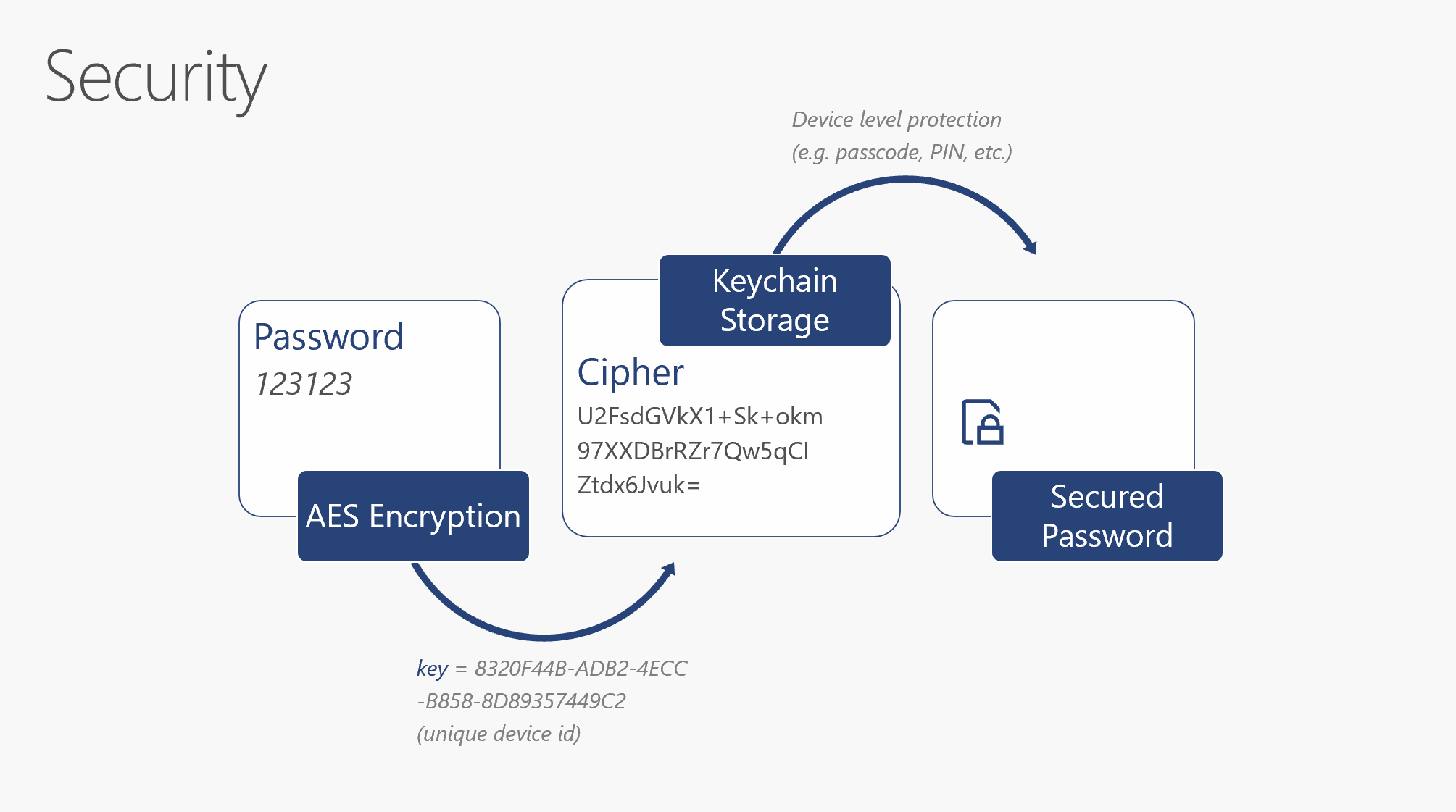
Fig 3 - Newly implemented security system
How can Aspen be improved
I am looking forward to incorporating some features of my app into the official Aspen app, and I am glad to work with both CPS and Follett in order to make this happen. The source code is available on GitHub under MIT license. However, if that doesn’t work out or if there are any legal issues, I can stop distributing the app upon request, but the source code shall remain available on GitHub since that’s just for technical exchange purpose, and I hope the code can be always available to anyone who is interested in learning to build apps with React Native.
In conclusion, I would like to provide some of my opinions on how can we improve Aspen and provide a better experience to students. Some of the opinions are personal, and others are from my friends.
First of all, the website itself and the app look outdated. Even though that doesn’t seem to be too much of an issue, but when things come to user experiences, it is always important to make the design a little bit more modern. The mobile version of Aspen, despite the unavailability in CPS district, is also outdated because the interface is apparently not adapted to the latest iOS version. Since the app is built with earlier iOS SDK, the UI elements appear to be bigger than normal, which makes navigation harder.
Secondly, the lack of a functioning mobile app. After all, all students want is just an easy way to access their grades. The mobile app, on the other hand, seems to be an app designed for receiving general notifications but not grades, and you can easily tell that the UI is a little bit kind of disorganized even by just looking at the screenshots attached.
Fig 4 - Mobile app with oversized UI elements
Lastly, but also most importantly, navigation and accessibility. There are too many redundant buttons on the webpage, and those extra buttons make it confusing to navigate the page. For example, the “Page Directory” on the home page literally serves no purpose. There are even two close buttons in some of the popup windows. Those redundant buttons and buttons that are not functioning on the CPS version of Aspen should be disabled. The website also contains a lot of incomprehensible acronyms or codes. Taking the “Attendance” page as an example, the attendance status is denoted with codes. Personally, I admit that using codes and acronyms can save a lot of space, but it can only become totally confusing if there isn’t a legend which explains what the codes mean. Moreover, there are a lot of minor UI glitches on the website in general. I call them “minor” issues because they are not significant on their own, but adding them up can be a big drawback on the general user experience. The example is the “detail” button in the navigation bar. When you are checking your schedule, for example, before even clicking on any buttons, it shows a “detail” button on the left navigation bar. It is confusing because it makes people think that the button can lead them to the page which shows them the detailed schedule, which in fact doesn’t work as intended. After clicking the button, it actually takes user randomly to the detail page of a specific class. It makes sense that the detail button shows users that “they are currently on the detail page” when they are actually viewing that page, but it should be hidden when they are on any other pages. The same issue is observed in “Academics” page for the “details” and “assignment” button.
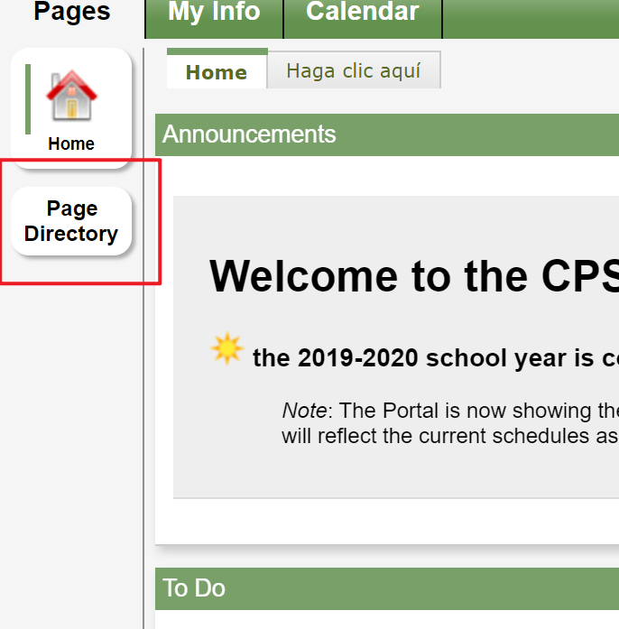
Fig 5 - Page directory button

Fig 6 - Redundant buttons
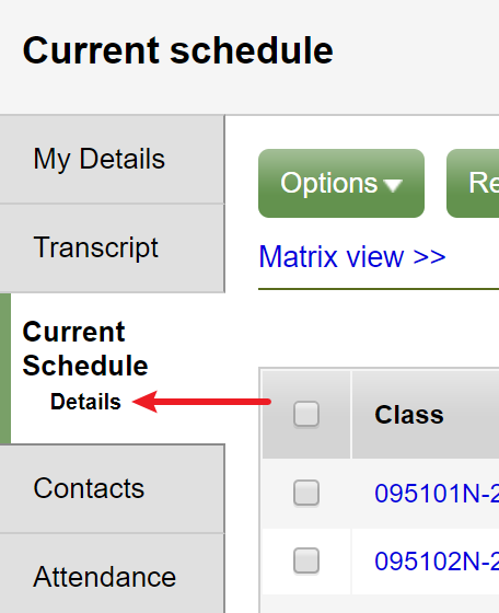
Fig 7 - “detail” button mentioned above.
Some essential features are hidden so deeply that users often feel confused when it takes them way longer time than it should be to find the information they need. For instance, in order to check the grade of a class, students have to go all the way to “Academics -> class name -> Details”. If they are trying to check the grade for a specific assignment, they have to go to “Academics -> class name -> Assignments” and then click the name for that assignment. The attendance tab is also hidden somewhere in the “Academics” section while in my opinion, it should be in a separated section with all the attendance information.
The mobile version, which is supposed to provide only essential information and be easier to navigate, is not really any better than the full site. The whole navigation system is still hard to use, and students have to navigate between different irrelevant pages in order to get the information they need.
In addition, the web version of Aspen is not friendly to visually impaired users. With a native mobile app, users can take advantage of many built-in accessibility features including VoiceOver on iOS.
Again, it is a good thing to have different information aggregated on a single website, but what students really care about is to locate the essential information (grades, attendance) as quickly as possible. That’s the main reason why I propose an “Express” version for Aspen, and hopefully a mobile version as well. I am not trying to show off anything, but the fact that students prefer to use the GradeTree app does show the necessity of such an app. Therefore, I sincerely hope you can consider my proposal to incorporate GradeTree as a part of the official Aspen portal and provide students with a better mobile experience.
Screenshots
